



















Why start a homepage with an outline instead of a Framer template?
A startup homepage template in the useful sense is the order of sections and what each one must say, not a visual layout. Visual templates are easy to find: Framer's marketplace lists many, free and paid. What they can't supply is your headline, your proof and the one action you want visitors to take, and those decide whether the page works.
The homepage also does more work than most teams expect. TripleDart's study of 28 B2B SaaS companies in Q1 2026 found homepages got 31.9% of LLM citations and 81.7% of AI-attributed leads. Write it first, then pick or design the layout around it. Our guide to the startup homepage covers the strategy in more depth.
How do you use this homepage template?
Write the one-sentence version
Before any section, write: we help [who] do [what] without [pain]. If that sentence isn't clear, no layout will save the page.
Copy the ten sections into a doc
Fill in the prompt under each. Leave proof sections empty rather than inventing logos or quotes.
Cut what you can't fill honestly
A pre-launch startup may skip case studies and integrations. A shorter, true page beats a long, padded one.
Read it out loud to a buyer
Ask someone in your target market to read the doc and tell you what you sell. Fix whatever they get wrong.
Then build it
Pick a Framer template whose section order is close to yours, or design from scratch, and paste the copy in.
The template: ten sections, in order
Section | Its job | Copy prompt |
|---|---|---|
1. Navigation | Let buyers find pricing, product and the CTA | Product, Pricing, Customers, About, [Primary CTA] |
2. Hero | Say what it is, who it's for, why now | [Outcome] for [audience], without [pain] |
3. Proof bar | Show that real people use it | Logos, a user count or one quote you can verify |
4. Problem | Name the pain in the buyer's words | Today, [audience] still has to [painful task] |
5. How it works | Make the product concrete in 3 steps | Connect [x], [action] happens, you get [result] |
6. Key outcomes | 3–4 benefits, each tied to a feature | [Benefit]: because [feature does what] |
7. Product proof | Show the real product | Screenshot, short demo or interactive tour |
8. Testimonials or stories | Let customers say it for you | Quote, name, role, company, specific detail |
9. FAQ | Answer the objections before the call | Price, setup time, security, switching |
10. Final CTA | Repeat the one action, with reassurance | [CTA] + what happens next |
Sections 1 to 3: navigation, hero and proof
These three sit in or near the first screen, so they carry most of the page. Our guides to hero section design and what belongs above the fold go further.
- Navigation: five or six items at most, with pricing visible if you publish it, and one primary button in a contrasting style.
- Headline: the outcome and the audience in plain words. Test it by asking whether a competitor could use the same line. If they could, make it more specific.
- Subheadline: one or two sentences on how the product delivers the outcome.
- CTAs: one primary (Book a demo, Start free) and at most one secondary (Watch the demo, See pricing).
- Hero visual: the actual product, not an abstract illustration. Buyers want to see what they would use.
- Proof bar: customer logos you have permission to show, or investors if you're early. Our guide to the trusted by section covers what to use when you have little.
Hypothetical example: a filled-in hero and proof bar
For example, suppose a seed-stage tool that turns sales calls into CRM updates fills in sections 2 and 3.
Headline: "Your CRM, updated after every sales call." Subheadline: "[Product] listens to your calls, writes the notes and fills in the deal fields, so reps stop doing data entry at 6pm." Primary CTA: "Start free". Secondary CTA: "Watch a 2-minute demo". Visual: the real call summary screen next to a CRM record being filled in.
Proof bar: "Backed by [investor names]" until the first customers agree to be named, then a logo row. No user count until there's a number worth stating.
Sections 4 to 7: problem, how it works, outcomes and product
This middle stretch is where the visitor decides whether the product fits their situation. Keep each block short and concrete, and connect every claim to something the product actually does.
- Problem: two or three sentences or three short pain points, in the words customers use on calls.
- How it works: three numbered steps. If it takes more than three, group them.
- Outcomes: three or four cards, each with a benefit headline and one line naming the feature behind it.
- Product proof: a short, captioned demo or an interactive tour. Our guide to the interactive product demo compares the options.
- For multiple audiences: add a short "Built for" block that routes each buyer to their own page, rather than writing the whole homepage for everyone.
Sections 8 to 10: stories, FAQ and the final CTA
- Testimonials: two or three real quotes with a specific detail each (what changed, what they replaced). Never write or edit a quote into something the customer didn't say.
- Case study links: if you have stories, link to them here, and keep the homepage version to one line each.
- FAQ: four to six questions. Write the answers so each one makes sense on its own. Our FAQ section guide explains the format.
- Final CTA: repeat the primary action, say what happens after the click (a 30-minute call, a free workspace), and remove anything that competes with it.
- Footer: product, company, resources and legal links, plus contact and social.
How does this outline map to a Framer build?
Each row of the outline becomes one section in Framer, and the repeated parts become components. Framer handles responsive breakpoints, components with variants, a CMS and hosting in one tool, which is why it's a common pick for startup homepages. Features change, so check Framer's current documentation for limits that matter to you, such as CMS size or localization.
Outline part | In Framer | Tip |
|---|---|---|
Navigation and footer | Shared components used on every page | Build once, so edits apply everywhere |
Hero and final CTA | Page sections with a CTA button component | Keep one button style for the primary action |
Outcome cards | A card component with variants | Same structure for every card |
Testimonials and logos | Components, or a CMS collection | Use the CMS once you have more than a few |
FAQ | An accordion component | Keep the answers as real text, not images |
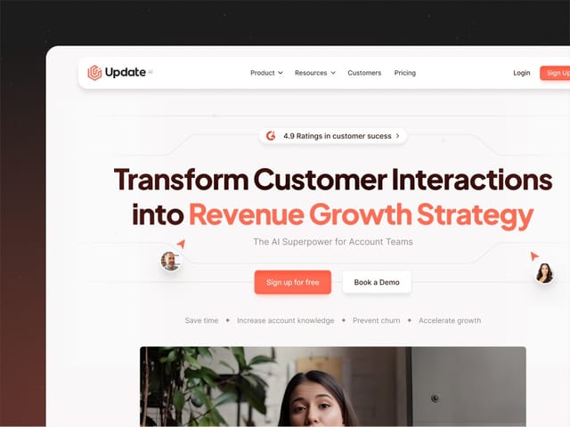
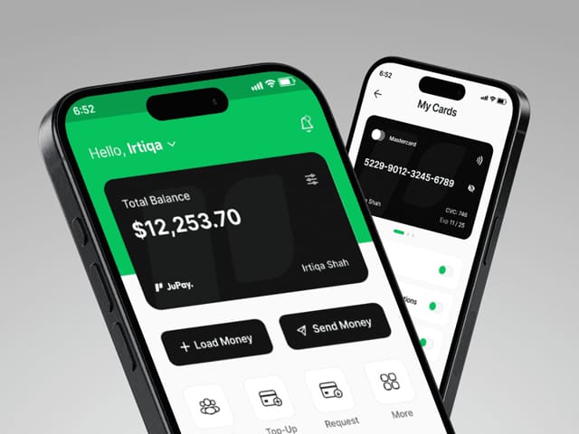
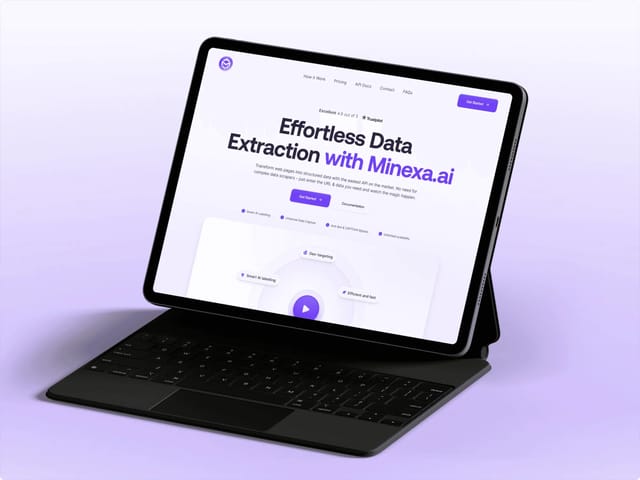
If you outgrow Framer, the same outline carries over to Webflow or Next.js unchanged. We build in Framer, Webflow and Next.js, and we designed and built the sites for Update.ai, Jupay and Minexa AI. See our Framer agency service or our startup website design work. Our website package is $8,000 fixed for up to 6 pages, plus $500 per extra page, and the first step is a free 30-minute call. Before you book, you can score the draft with our landing page grader.